Test Background
Although people mainly use PC-side websites and mobile apps for information search, the browser on the mobile phone is still an important search portal. Due to the inconsistency between the screen size of the computer and/or mobile phone, and the differences in the habits of mobile users, the computer-side website cannot be directly transferred to the mobile terminal. It is necessary to consider compatibility and user habits in line with this. However, a large number of websites are not optimized for mobile, or if optimized, there are still some errors, resulting to poor mobile user experience. Thus, it is still of great significance to evaluate the user experience of the mobile phone website. Now, let us use a case to demonstrate some pointers on usability research–how to do mobile site heuristic evaluation.
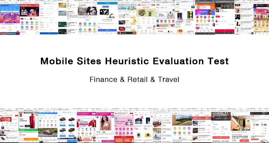
In 2018, USER, a UX design agency, conducted a half-year mobile-site usability testing service/program involving financial, retail and travel industries, requiring testing for more than 400 representative websites from over 10 countries in the Asia Pacific. As an opportunity, the user experience consulting agency was able to have an in-depth understanding of the overall performance of the entire mobile phone website.
Test Process
We take into consideration these pointers that would complete and effectively impact the whole test process:
- Test Object: The availability performance of the three representative websites of each country in the mainstream browsers of popular mobile phones (not the PC side nor the mobile app, but the mobile webpage that the mobile browser opens). Because the end client is a browser development company, they want to understand the performance of each website in the browser so that they can update their browser.
- Test Criteria: Heuristic evaluation aspects (as rubric) on website plus test methods used, and divide the results into: Passed, N/A, Failed.
- Evaluation Criteria: Weighting points, out of 100.
- Collaboration Form: Share Excel test template via Google drive, PPT report, steps like test ahead of deadline-> Review-> Random check->-Modify-> Complete; update progress in real-time, online and offline communication; disputed classification discussion solution to ensure consistency.
- Output: Test results and test reports.
- Test Meaning: Test the performance of existing websites and provide valuable optimization suggestions to browser developers and owners of various industry websites.
Test Methods
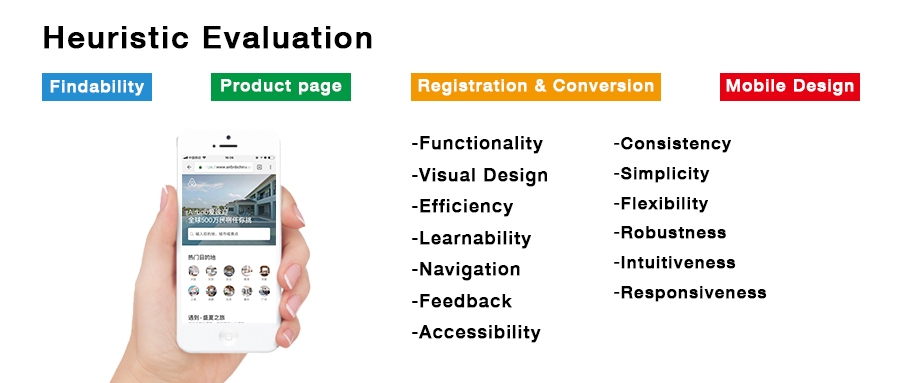
Heuristic Evaluation is a method of assessing whether user interface elements conform to principles based on a set of rules. The principles of mobile website design are mainly evaluated in four aspects: findability, product page, registration and conversion, and mobile design.
- Findability is mainly visibility, search and screening functions.
- Product page is about product details and image quality. High quantity is visible; cargo balance is visible; main button is highlighted; and visitor can favorite and purchase a product.
- Registration and conversion refer to display price and arrival date as soon as possible. The form filling progress is visible; return is not lost; and contact information is automatically filled.
- Mobile design is for the mobile page itself. Icon and text tag pairing; https and lock icon to ensure security; cross-platform user experience, and so on.
The Usability Test Expert simulates the situation in which a typical user uses the product in a role-playing manner, and performs a User Journey based on the User Story to find potential problems. User stories are features that describe the value to the user. A good user story should include three elements: Role, Function, and Business Value. The User Story is usually in the format: as a <Role>, I want <Feature> to facilitate <Business value>. When testing, the test follows the order of the user’s journey.
Each site’s rule (Passed, Failed, and N/A) is based on a single score and weight setting/ranking/screenshots/reasons for failure/impact/recommendations.
Test results
Summarize a large number of website performances, make rankings, and list best practices websites, and refine what are the characteristics of them. Through the comparison of scores between horizontal, vertical and national, the principles of mobile phone website design is more deeply understood and analyzed, and valuable suggestions for compliance with the website are given. The recommendations are objective and targeted. Finally, an output called the usability test report is presented to potential clients.
Wrap up
The testing journey is long and full of iteration. One could leave out something inevitably. Fortunately, the team is composed of specialists. Teamwork can help make the report more complete and professional.
USER provides Website Usability Testing and has helped many clients lead website usability test, whether PC websites or mobile websites, even mobile apps. By applying the test report to optimize their products, clients greatly improved the user experience of their products.


