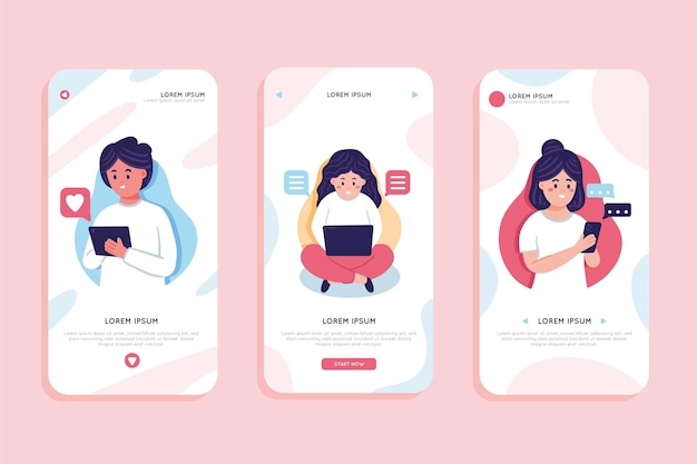
Design trends often follow a generation’s subcultures. In Southeast Asia, the current trend is maximizing user experience while maintaining a minimalist approach to design.
It’s a challenging and amusing combination, and many apps and websites in the region are gradually changing their interfaces to create a seamless look. From e-commerce to news pages, they clean up their pages as they expand functions and integration with related vendors, partners, and advertisers.
By far, Apple and Google are the most notable brands to succeed with this contrast in design and utility. Their no-frills concept stretches across the board from products to marketing and even physical stores. In recent years, major SEA apps such as Grab, Shopee, and Viu are now adopting low-contrast graphics to balance richly-detailed images, using subtle yet easy-to-understand interaction icons.
What makes a minimalist approach so appealing? Here are some interesting factors to note.
Easier on the Eye
Any UX design agency or design expert focuses on making things easier for users. The easiest way to create that sense of effortlessness is to make the visuals feel “lightweight”.
According to a study, visual complexity affects user’s perception, and it can affect user experience in the long run. It’s not just about aesthetics, too. Another study reports that simpler interfaces and pages result in lower bounce rates in general.
Carousell, a Singapore-based selling platform, displays effective balancing of elements and visual space with their web and mobile app. Their responsive design separates images, buttons, and text fields that make it easy for users to browse and read details.
Increasing Functionality with Gestures
Another trend gaining popularity in Singapore web design is the use of motion UI or gestures to reduce clutter. Hand or device-based motion can introduce new functions, removing the need for popups or subsequent pages. It is incredibly effective for portable devices such as smartphones and tablets.
Short-form video and dating apps popularized “swipe” mechanics, while e-commerce apps use scrolling or other gestures. For users, gestures help them appreciate better what they’re currently looking at, especially when presented with a large amount of content. In one study, it is revealed that fewer clicks can improve conversion rates, and gestures surely reduce such interactions on mobile.
Gestures also help in displaying data visualizations, flowcharts, and idea maps for productivity suites and other enterprise apps.
Gives Space for More Interactive Tools
Recently, AI and other UX assistants such as chatbots are also increasing in usage across websites and apps around the world. Minimalist interfaces allow other tools to be integrated into the content while maintaining a tidy appearance.
New tools also help in creating a more spacious canvas. Voice-assisted input methods can reduce the need for more on-screen buttons, and the method has already been implemented by search engines and other platforms as part of their accessibility features.
Conclusion
“Less is more” is taking a new form in modern web design as it translates into “doing more with less.” Creating a minimalist design requires a lot of tedious steps, and if your business doesn’t have the time or capability to efficiently streamline a design, it’s best to partner with a reliable UI UX design agency like USER. We are a Singapore-based firm with in-house experts in UI, UX, mobile app design and development, and more. Know more about us by sending inquiries to https://dev-user-website.useritech.com/contact/.


