Dark mode was an experimental color scheme that took web design and development by storm with unprecedented demand from users wanting it on their screens. It was only as recent as 2018 to 2019 that it surged as many tech giants – including Apple, Google, Facebook, and even Twitter – all launched a collective slew of dimmed user interface (UI) designs. But before them, it was Microsoft that heralded the movement by enabling dark mode for the Windows 10 desktop OS in 2016, as well as some apps.
Despite criticism from camps that deny the supposed benefits of dark mode, it went on to become the go-to alternative, the flip side to the “light mode display” we’re used to seeing. Almost all mobile systems and even web apps today have incorporated one or more schemes with this dark-biased theme. How all of this happened is surprisingly a UX story.
Dark mode was the default, until…
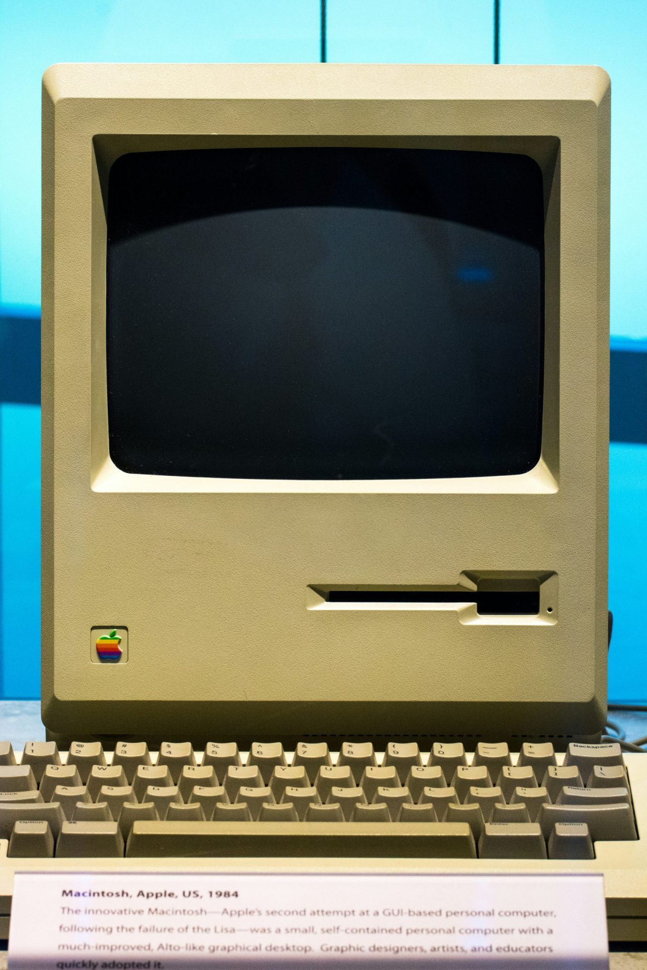
In the early days of computers with displays, screens were actually on dark mode by “default” – because it was a technological handicap. Early cathode-ray tubes, the ancestors of today’s flat LED screens, could not generate a “positive polarity,” or dark-on-light display. As the technology evolved, screens gained this capability as computers became more mainstream.
This display scheme mimicked how humans naturally viewed objects, like ink on paper. Like today’s user-centric web design and development, it was all about making computers and their screens more convenient and comfortable to its users.
What Fueled the Dark Mode Revolution?
The advent of the internet triggered the website development gold rush, with companies left and right turning computers into the new everything. Banks, marketplaces, governments, schools, and even organizations came up with interesting digital platforms which, through progressive user demand, indirectly contributed towards the development of apps in mobile devices.
With the rise of smartphones came the yearly rise in their usage as the new medium of internet usage. According to a 2018 study by RescueTime, people on average spent three hours and 15 minutes a day using their phones. Dark mode, according to its supporters, supposedly lowered eye strain and made screens more user-friendly during the night or in dimly-lit environments. This is yet to be proven by science, as many studies show conflicting results to conclusively say dark mode is better or worse than “light mode.”
What’s consistent, however, is that it’s always impressive for some users and convenient in some situations.
Improving Web and App Development
The most intriguing thing about dark mode is how users suddenly prefer it due to the habits of people – developers included. Despite evidence suggesting that human eyes read better with a positive polarity approach on text, dark mode is said to have helped users focus and boost some aspects such as color perception.
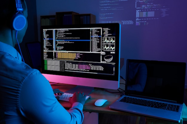
For instance, coders and developers have long favored using a dark-themed interface as color-coding text helped them see process flows better. This could also be helpful for users scanning for their desired content in websites and social media – where video is becoming more and more mainstream.
Good UX can contribute to boosting conversion rates up to 400%, and this is important when 75% of consumers can base their opinions on design alone. This is why many companies avail of a web design service in Singapore or other tech-forward countries.
Conclusion
Design trends can be a fad – or it may be the next big thing you wish you’d taken advantage of early on. Learning from the eventual rise of Dark Mode can help you predict if certain trends can be helpful for your website or app’s UX. If you have no idea where to start, you can get help from experts such as User Experience Researchers Singapore (USER). We are a web designing company in Singapore that also specializes in UI/UX design, digital market research, and usability testing. Check out our services or inquire at https://dev-user-website.useritech.com/contact/.


